So I am to design for the interface of a chatroom-like application. Then I was thinking how do the successful chat application look like. This is challenging, though we use chat app all the time, sometimes the best designs are the ones that goes un-noticable. Lets have a look.
- iRC, Jabber, AIM
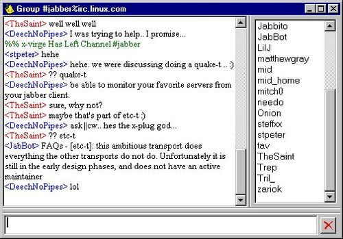
Starting from the early age of Instant Messaging, we have MiRC, ICQ, Jabber. You might think there is no UI here, but this is the UI. Messages in all three platform look like command interface with some color codes, no separation or boxes between the messages. In MiRC group chat, it has time status in the beginning then followed by user name then followed by the message. in Jabber there is only user name and followed by its message, the color codes only for user’s name, not the message. In AIM, it has names, followed by time and message.


- Yahoo Messenger/MSN
I dunno if this is their latest UI, but I remember YM looks like this in desktop version for their personal chat. There is only user name and No timestamp, only when user sign in there is a timestamp. Still no separator or boxes, but they leave some space between the messages, so it doesn’t look too command-line-like. Picture of the user is shown in separate part of the window.
..Later I found out that you can set your chat to have timestamp if you want. But still the default setting you don’t have it. Oh and I think I remember in YM there is a “Last message received on dd/mm/yyyy hh:mm” isn’t it? Can’t find pic again.. -_-

Moving into mobile application, YM’s UI looks like the following. It now has speech bubbles with picture of the user next to it. No timestamp though.
Then we have MSN, that have pretty much the same concept as YM but with different “skin”.
Hey, there you go! There is that “Last message received..” stuff. Maybe it was in MSN not YM? But I’m pretty sure YM also have it.
- Skype
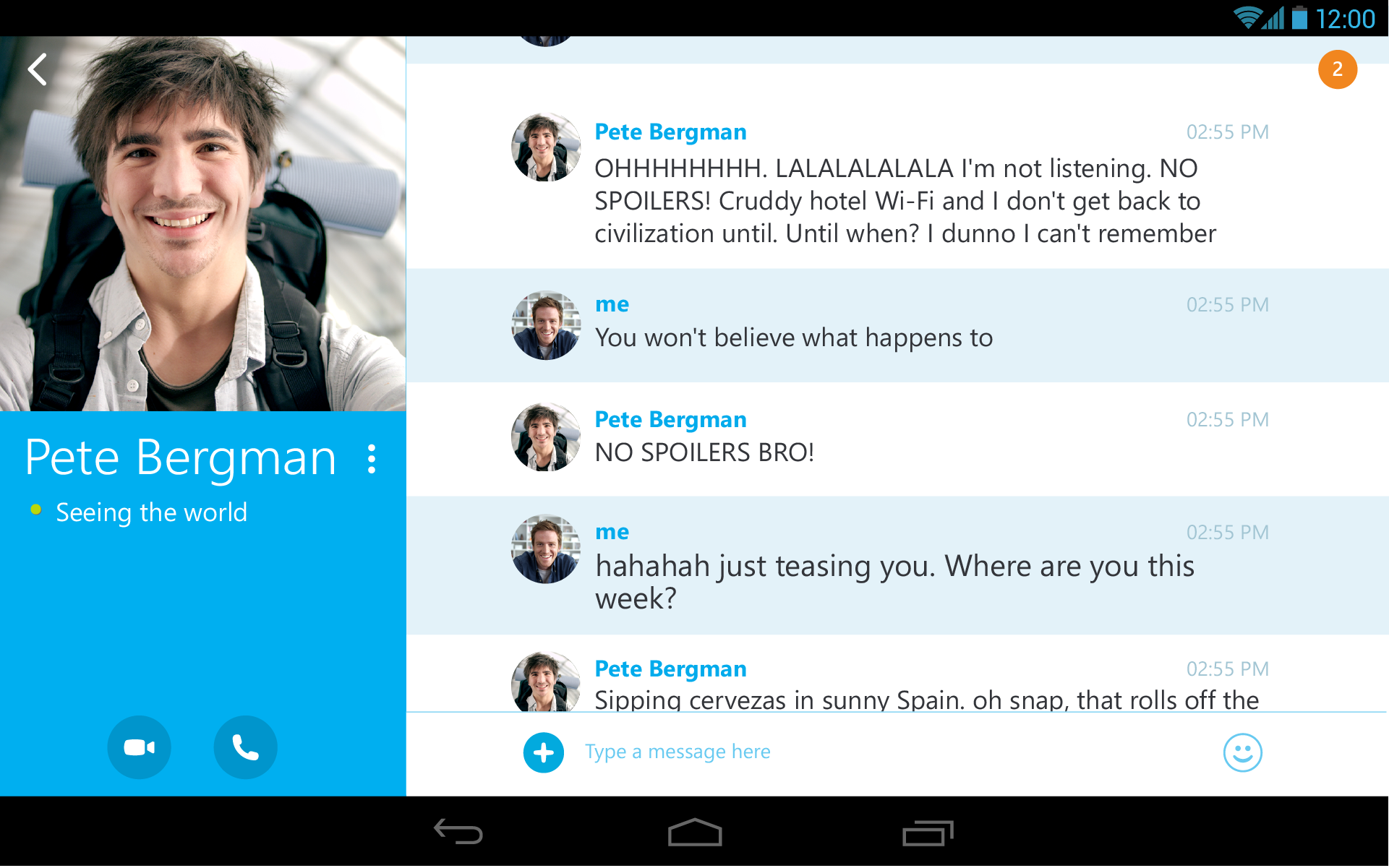
Moving oooon, we also have Skype. Skype’s UI is on one window only, you click the user to talk to to switch between chat windows. Compact! Also the messages are arranged with grids. You have the name on the left, message in the middle and timestamp on the right.

In Android, Skype is also consistent with its grid design (almost), with addition of user pic and different background colors for each message.

In iPhone, they don’t have pictures, but have speech bubbles like regular messages in iOS.

- Google Talk/Hangout
Ah now comes Google Hangout! It has cool kind of speech bubble stuck with user pic aaand instead of timestamp, it has minutes, how many minutes ago the message was sent. Desktop and Android is similar, but with iPhone it’s a bit different.
Now this champion messenger has just proved its value by being bought by Facebook. Still the cross-platform messenger have different looks in different platform. Maybe different platform has its standard? Like the metro design in WP means the speech bubbles have pointed edges and same username color, whereas iPhone and Android has rounded edges, color coded user name in groups. In personal chats there is no name, just message and timestamp. The timestamp is always on the bottom left of the speech bubble


- Facebook Messenger
In Facebook Messenger, we have pics and messages and their “seen” status. In personal message there is no user name, but in group chat it is shown. They play with font sizes here rather than color coding. Logically, color codes aren’t necessary when you already have pictures. No timestamps for each message, but there are time header when messages are sent in big gap time.

I know there are more IM/Chat/Messenger apps, but this post is too long already, and I think you (or at least I) get the idea. So what is your opinion about IM/Chat UI? What are the important elements? What works for you and what doesn’t ? Or… you just don’t care? LOL
For me personally, I like the design of FB Messenger because 1) timestamps aint that important for every message 2) using pics is nice, rather than color coding. Google Hangout’s speech bubble is fancy and unique, but showing how long ago message was sent I think is not that important. But I like Whatsapp as well, as it is more “compact” and doesn’t waste so much space but still easy to read.
Tho I picked my favourite design, in reality the design is not the main reason why I use that messenger. Hahaha. For me in a messenger the most important thing is which contacts are available for you and how you reach them (email, phone number, friends request, etc). But does that mean design is not that important for IM/Chat? Well, do remember that most of the time we only notice design, not good design :p The correct term for it is probably “designing for context”. And I still need to learn more about it. Maybe it’s time to create the next big jump?


Leave a Reply